Connect, automate, and sell your vision to the world
Experience the email and automation solution that takes your business to the next level

Easy-to-use marketing solutions for quicker success and at a fraction of the cost of other solutions
What you can do using AWeber
Effortlessly attract more customers

Ready-made, eye-catching landing pages
Sign up forms you can easily add to your website
Connects to your other tools to grow your list automatically
More ways to increase revenue

Set up your online store in minutes
Get paid through subscriptions and payment plans
Collect payment in 100+ currencies
Keep your customers engaged and retained

Increase engagement with personalized emails
Build email marketing campaigns quickly and easily
Create emails that nurture trust and loyalty
Let automations do the heavy lifting

Respond to leads at the right time with email automations
Get 90% built automations, just customize and activate
Increase sales with upsell, cross-sell, and abandoned cart emails
Get more eyes on your content

Automate getting more Etsy Sales with less work
Automate increasing YouTube views minutes after publishing
Automate getting more readers to your latest blog post
There's a plan to support you every step of the way

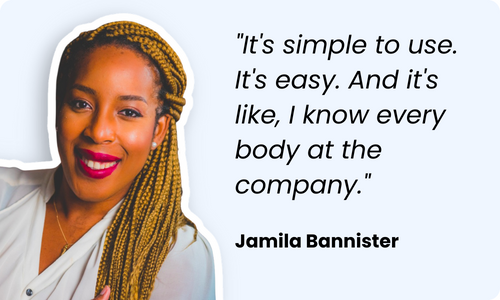
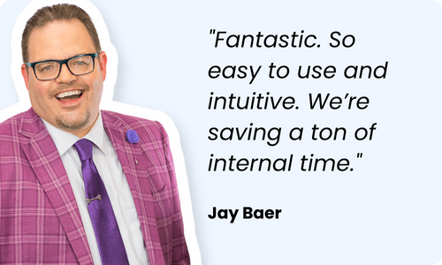
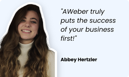
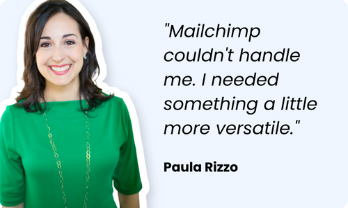
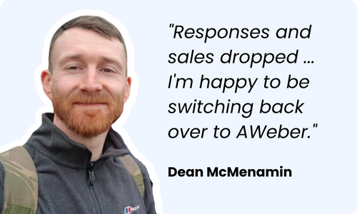
Customer love stories: How AWeber changed their lives!
Streamline your workflow - connecting your favorite tools
We make it easy by connecting to 750+ tools you're already using to run your business.
Paypal
Shopify

WordPress


Zapier
Make the move to AWeber without the stress
24/7 support for you
Phone, live chat, or email with highly trained in-house specialists.
Contact us