What’s New
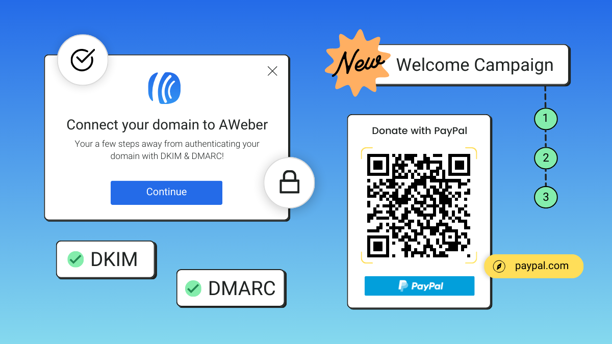
[New Features] It’s way easier to set up DKIM and DMARC
New improvements to help you get in compliance with Gmail and Yahoo sender requirements plus other updates to help you build your list and earn more.
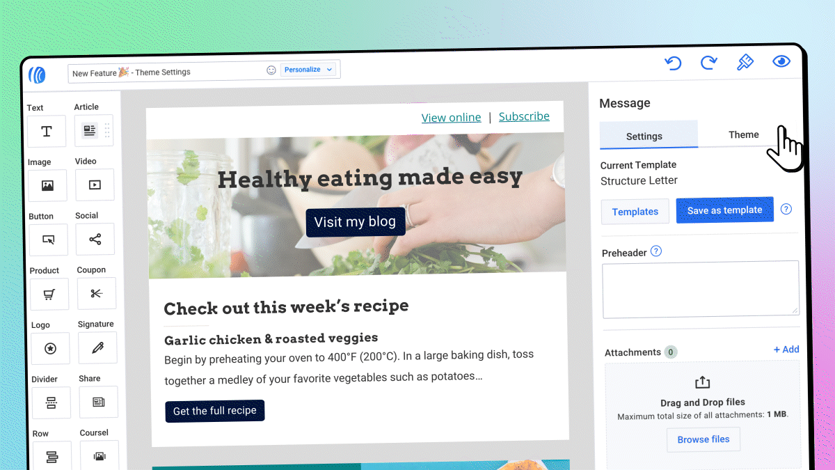
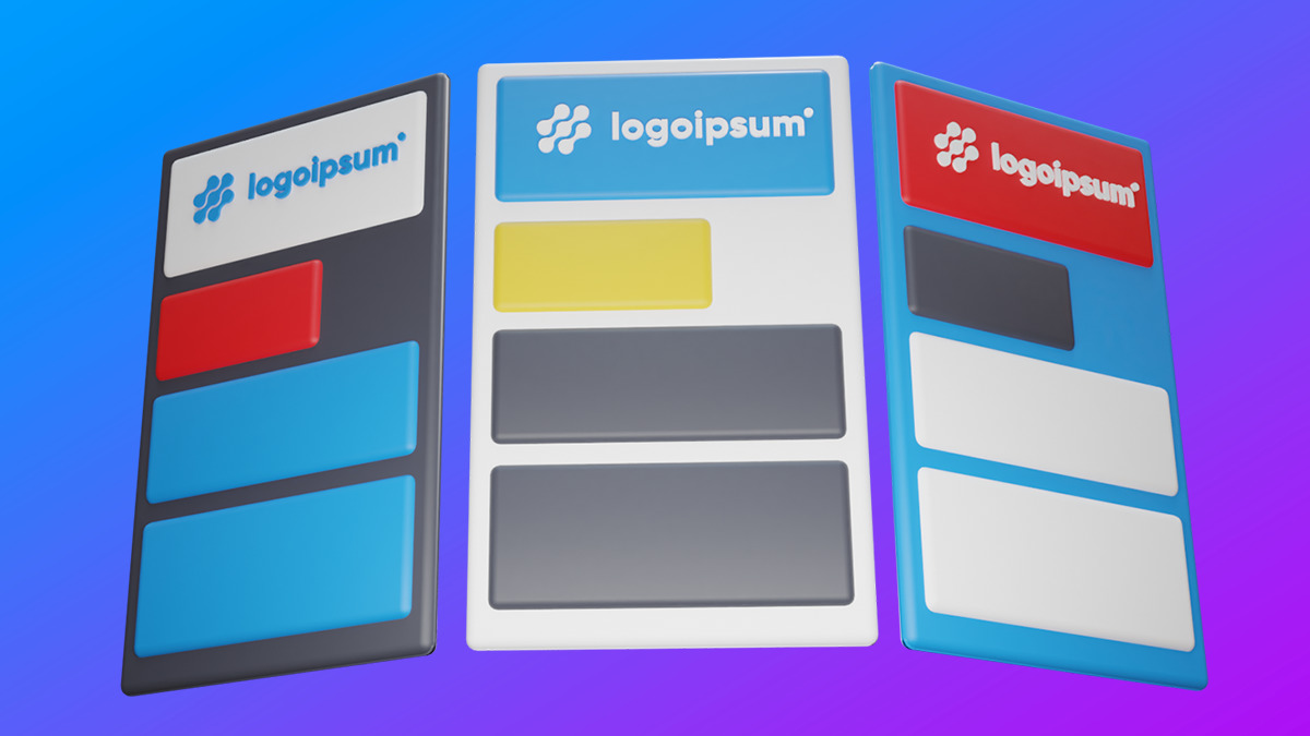
Keep your emails consistent and beautiful with Theme Settings
Create beautiful, on-brand emails—changing colors, button styles, fonts, and much more—in less time with universal theme settings.
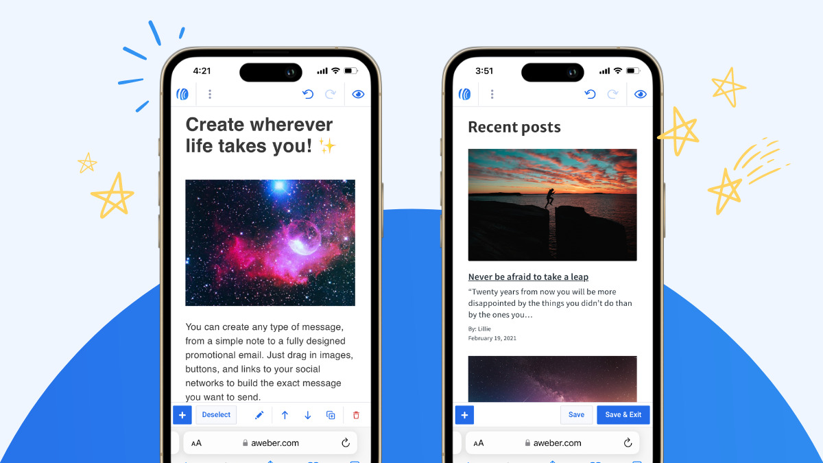
Design and send emails from anywhere
Create, edit, and send your email messages with ease, no app installation required.
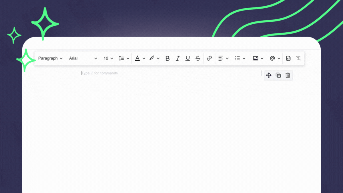
Build emails faster and with less distraction
Writing emails in AWeber just got even quicker and easier. New keyboard shortcuts make it simpler to create a message without losing flow.
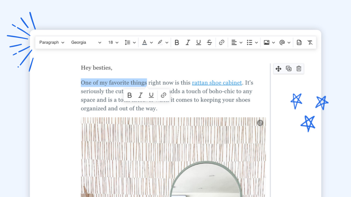
8 email editing improvements that make writing emails super fast in AWeber
We made several updates to the editing toolbar to make quicker and easier for you to write emails.
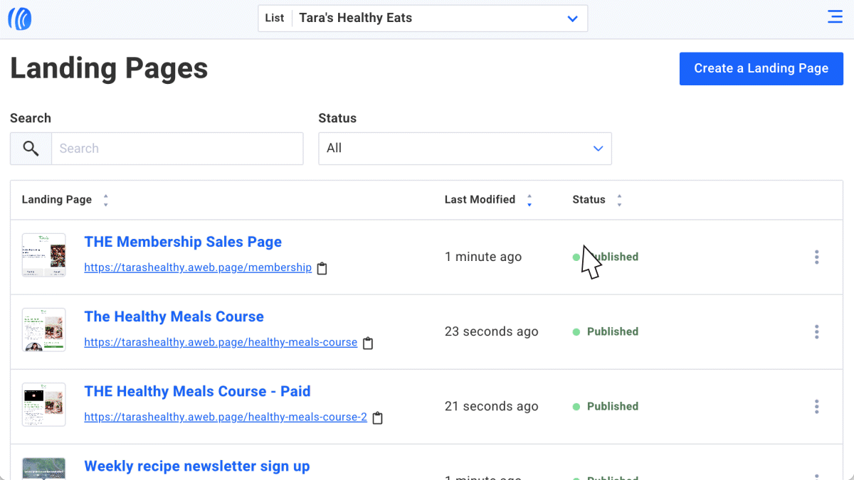
Searchable, sortable, and mobile-friendly pages
AWeber has been upgrading some pages in your account. It’s now a breeze to find and manage your landing pages, campaigns, tags, lists, and imports.

2022 Year in Review: The Best Tools for a Productive New Year
Catch up on our year full of newly released features and functionality, built for you.

Paste your link, hit return, and a preview magically appears in your email
Something huge has happened with links in the AWeber message editor. They can now expand into “preview cards” automatically.
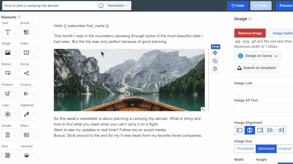
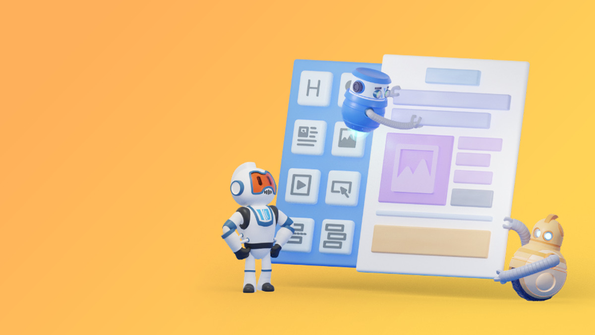
Fewer steps to build an email: Drag elements in-between paragraphs
Create your next email faster with images, buttons, and videos added directly into the text element.
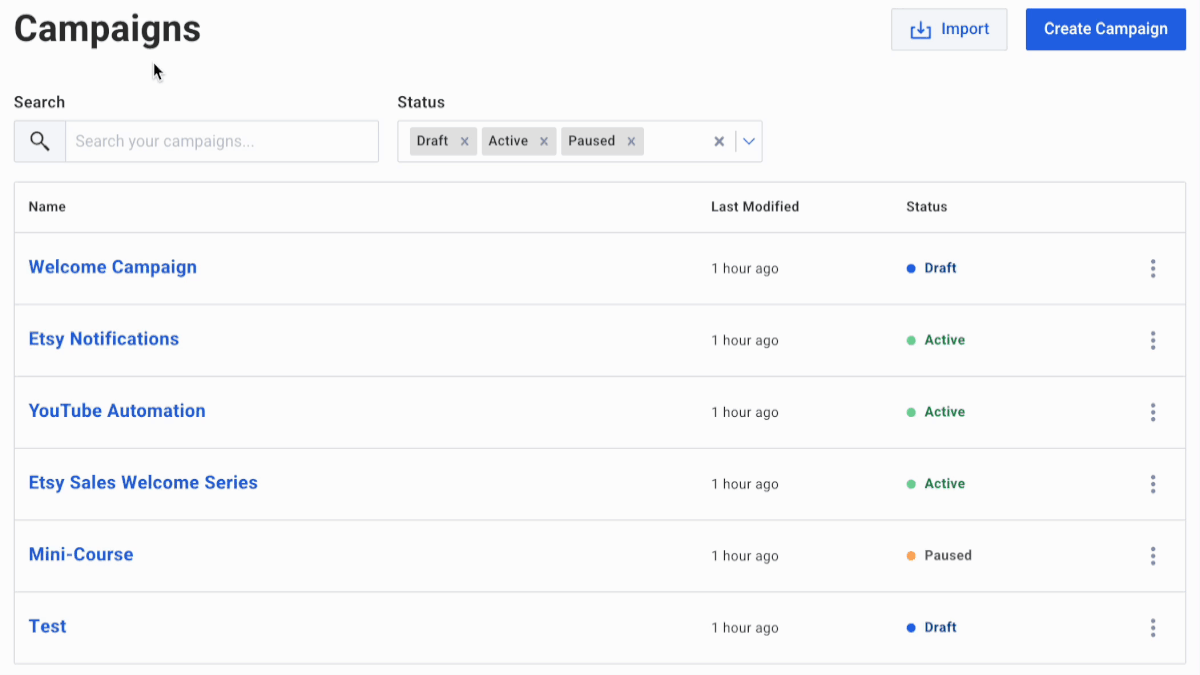
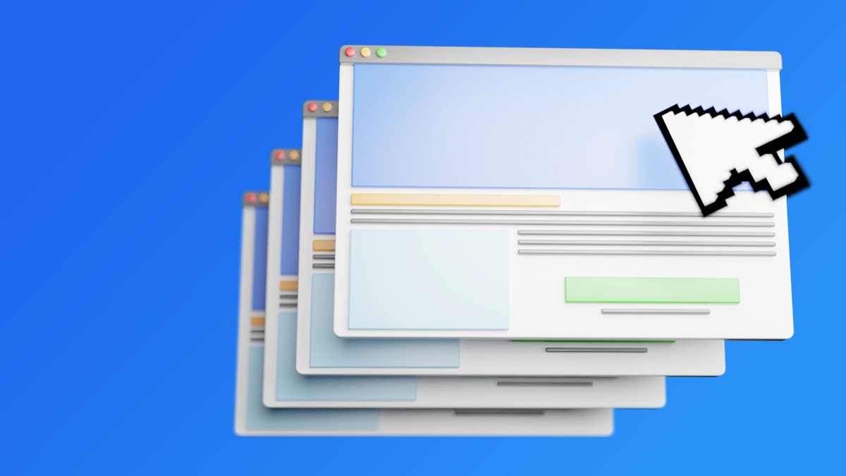
Find your campaigns faster on the new index page
It just got a whole lot easier to search and sort campaigns in your AWeber account — on desktop and mobile.
Create beautiful emails in half the time with AWeber’s new link previews
Engage your readers with link preview cards you can add in a moment. Expand your articles, product pages, and videos into enticing displays — just by pasting a link.

Get more YouTube automation emails opened – add video titles in subject lines
Send automatic emails when you publish new YouTube videos. Get more opened with video titles in the subject line.

Join the Sell Something Challenge
Make some extra money and learn a new skill. See how easy it is to earn extra money, sign up now to begin.
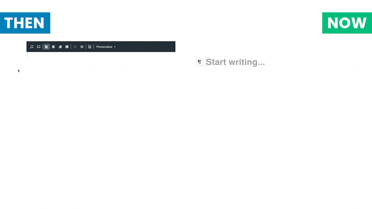
Write emails faster with new message editor updates
Fewer distractions, faster formatting, and more improvements to make your writing experience better in the message editor.

Get more engagement when you set email campaigns to arrive by time zone
Send emails that arrive in your subscribers’ inboxes at 10am (or whatever time you choose) — no matter where your subscribers live, worldwide.

Get more eyes on your latest content with auto newsletter
Do your fans know you just published something new? Now, when you publish a podcast, blog post, YouTube video, or Etsy product, you can send a notification email automatically — with no extra work.

New: AWeber Advocates can now earn up to 50% commissions
Refer as few as 10 customers a year and start earning a higher commission rate.
Build and Monetize Your Community with Newsletter Hub
Get more subscribers, make money, and build a community — all using your Newsletter Hub!

6 Reasons to Use A Dark Background in Your Email Design
Use our newly designed email template called “Fresh” to start writing your next email. The six examples below show how and why to design with a dark background.
Connect a Custom Domain to Make Your Landing Page Professional in Minutes
A custom domain makes your landing pages professional. Connect your domain to your AWeber account.

Accept Payments in 100+ Currencies with AWeber Ecommerce
We’re constantly looking for ways to make it easier for you to achieve your sales goals.

How to Utilize Crowdfunding & Donations in Your Business
You’ve heard of subscriptions and payment plans. Now, we introduce donations and crowdfunding — plus templates to get up and running fast.
Selling and Upselling is Easier Than Ever
Our newest features help you make money and save time with just a couple clicks.
Grow Your Income with Subscriptions & Payment Plans
Get more customers without doing more work when you offer monthly fees and payment plans — now available through AWeber Ecommerce.

New Features: 2-Step Landing Pages, a Vertical Menu and Celebratory Badges
We’re always adding new features, updates and templates to help you work smarter. Check out what’s new in your AWeber account this week.
New Menu Navigation Makes AWeber Easier and Faster
Give the new menu navigation a whirl and zip around your AWeber account with ease.
Access to Smart Designer & Landing Page Copying is Now Easier Than Ever
We’re always adding new features, updates and templates to help you work smarter. Check out what’s new in your AWeber account this week.
New Features Now Available: Create Logos, Promote Your Newsletter on Facebook, and More!
Find out what’s new in your AWeber account.
Landing Page Copying: Share Your Success With Your Audience
People trust those who share their secret to success. Make your landing page shareable to grow your audience and become the go-to expert in your industry.
Build Custom Email Templates with AWeber’s Smart Designer!
The AWeber Smart Designer is a game-changing email marketing feature that allows content creators and small business owners to automate email template design — create your own branded email template in seconds.
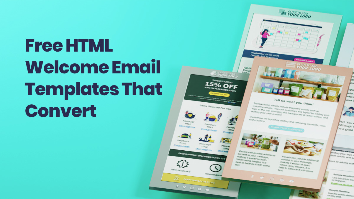
Free HTML Welcome Email Templates That Are Proven to Convert
Our latest HTML email templates are designed to help you quickly and easily create one of the most critical (and often-overlooked) messages: the welcome email.
Stay in the loop
Get best practices and advice to help you grow your business in our weekly newsletter.
