Best Practices for Double Opt-in
By Alyse Falk May 10, 2022
How you set up the sign up process for your email list can have a big effect on how engaged your subscribers will be later on. It might seem counterintuitive, but if you let people subscribe without any sort of confirmation, you can end up with a less engaged and less profitable list.
This is why one of the proven best practices of email marketing is to use “double opt-in.” In this post, we’ll cover:
- What double opt-in is
- Double opt-in versus single opt-in
- An example of how double opt-in works
- The pros and cons of each sign up setting
- How to set up double opt-in
- Common mistakes people make when they set up double opt-in
Double opt-in does require some extra work, both for you and your subscribers. But if you want better engagement, higher deliverability, and more sales from the emails you send, it’s usually the best way to go.
What is double opt-in?
Double opt-in, also called “confirmed opt-in,” is a method of subscribing to an email newsletter where subscribers have to confirm two times (hence the “double” opt-in) that they want to receive emails from you.
It is used to screen out invalid addresses and improves the overall engagement levels of a list. Once your list is sent up to use double opt-in, no one can accuse you of sending spam – neither competitors nor email services.
The double opt-in subscription confirmation process consists of two steps:
- A user leaves their email address in the subscription form on the site and clicks “Subscribe”.
- The user receives a subscription confirmation email to this address, in which they have to click on a link to be added to the mailing list.
Only then can the user receive email newsletters. Double opt-ins should be implemented in channels where consent to receive email is usually not explicitly given. Otherwise, you can get a lot of spam complaints and get blacklisted.
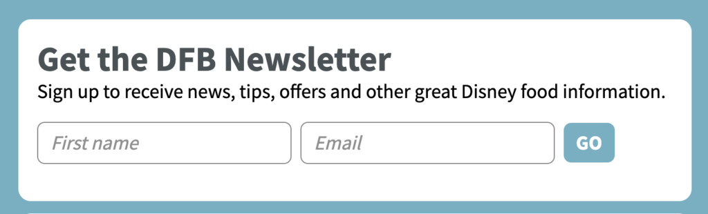
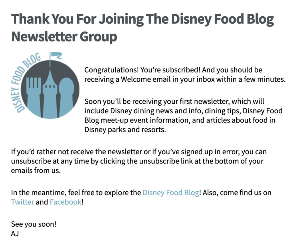
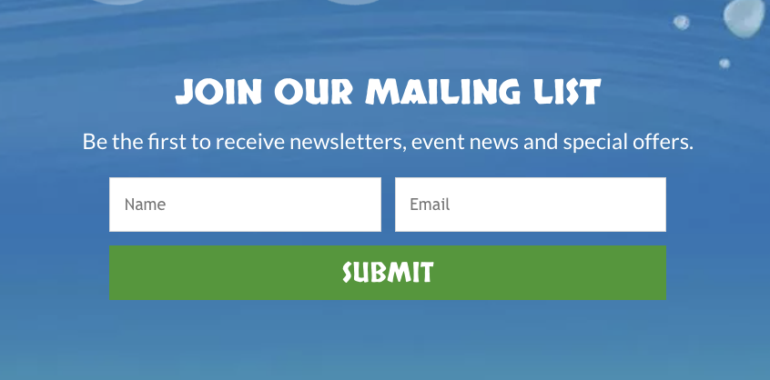
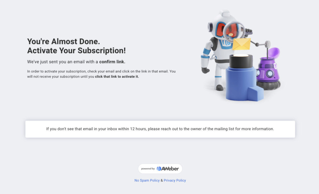
Here’s an example of confirmed opt-in sign up form from AWeber customer The Disney Food Blog.
Step 1: Someone fills out the sign up form on your website:
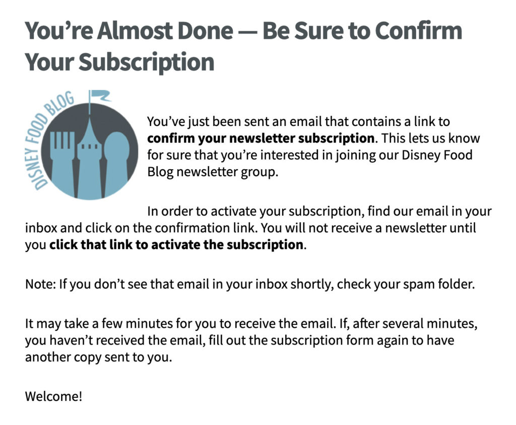
Step 2: They see a “thank you” page with instructions about how to confirm their address:
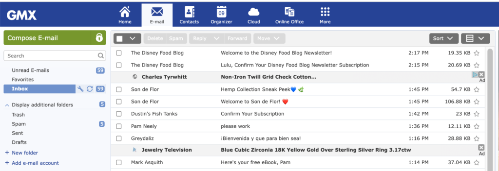
Step 3: They go to their email inbox and find the confirmation email.
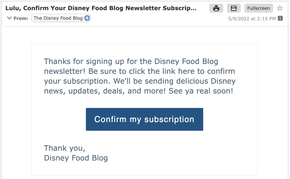
Step 4: They click the confirmation button or link in the confirmation email.
Step 5: They are brought to the final confirmation page.
What’s the difference between double opt-in versus single opt-in?
Single opt-in
This is when a subscriber enters their email address into a form, clicks submit, and is automatically subscribed to a list. There is no confirmation email sent with single opt-in. It is the most popular way to get new subscribers, but it does result in a lower quality list.
Among the emails submitted you may find nonexistent addresses, typos, or other people’s emails that their owners did not specify.
Sometimes single opt-in is used covertly. Users leave their mailing addresses on the website but don’t realize that they will be receiving emails in the future. Here are a few ways this can happen:
- Through online giveaways. A company offers a giveaway and requires people to submit their email addresses to qualify for the giveaway. Then the company either adds everyone’s email address to their marketing emails list, or they “ask” people in a way so subtle or disguised that no one realizes they’ve agreed to sign up for those marketing emails.
- Through a chatbot. The bot asks the user for the email address to resume contact later. But then the user’s email address is added to the marketing emails list, even though they did not expressly ask to be added to the marketing list.
- Through an order form. The customer places an order and is required to include their email address. This email address is then automatically added to the company’s marketing list (but without the customer’s express permission).
Double opt-in
Double opt-in requires customers to confirm their email addresses twice. It’s not enough for users to leave an email on the website. They have to find the confirmation email you’ve sent and click on the link in it to confirm the subscription.
The pro and cons of double and single opt-in
| Single Opt-in | Double Opt-in | |
| Convenience for the subscriber | The user doesn’t need to look for the confirmation email in their mailbox to subscribe. | Some people dislike the extra step confirmed opt-in requires. They already took their time to write the address and now they have to confirm it. |
| Email list growth | The mailing list grows faster because anyone who submits their email address is automatically subscribed | All of your contacts are included in the email database, but you can only mail to the subscribers that have confirmed their addresses. Double opt-in can slow list growth down a bit, but not much. |
| Email list engagement | Quantity doesn’t always mean quality. Single opt-in lists tend to have lower open and click-through rates. So even if a single opt-in list is slightly larger than it might have been with double opt-in, the double opt-in list will get more clicks and opens. | Double opt-in lists get more engagement – more opens, clicks, and sales. Don’t focus solely on the size of your list: what really matters is how engaged your subscribers are. Smaller lists can often drive better results than larger, disengaged lists. |
| Getting into spam | Inactive or mistyped addresses or spam traps can be added to the email list, which harms the sender’s reputation. | Only confirmed addresses end up in the email base. This means your list is “cleaner.” As a result, your email deliverability rates will be higher. |
| Email service providers | Email services might get suspicious about your list building practices | Even if they suspect you of sending spam, double (aka “confirmed”) opt-in will be one of the strongest arguments that you do everything by the rules and collect email addresses legally. |
When should a business to switch from single opt-in?
Some companies don’t understand when to change from single opt-in to double opt-in. You should switch to double opt-in:
- When you’re ready to prioritize list engagement over list size. Email lists may grow slightly slower with confirmed opt-in, but engagement rates will almost always be better.
- When your email marketing reports show a trend of low open rates. Low open rates can affect deliverability, which means fewer people will begin to see your emails. Switching to double opt-in is a proven way to turn this around.
- If you’re getting too many spam complaints. This is another red flag of a disengaged list and a sign that you need to start doing things differently. Start by switching to double opt-in.
Five benefits of double opt-in
The practice of double opt-in is a proven email marketing best practice. Some of its advantages are:
- Save time
As AWeber’s Customer Evangelist Emily McGuire explains, “A double opt-in will save you so much time later on. One of the main ways that email metrics tank is through lack of engagement. Eventually, unengaged contacts have to be cleaned out of your list to preserve your sender reputation and overall engagement. When subscribers double opt-in, they are engaged from the beginning which reduces your list cleaning efforts later.” - Engaged subscribers
Only a subscriber interested in receiving emails from you will take the extra step to confirm their email address. So a two-step confirmation is the first step to a quality mailing list. - Valid email addresses
You may not be aware of how many invalid email addresses you have on your mailing list. These can be old addresses, misspelled addresses, spam traps, or deliberately invalid addresses. You can enlist the help of address validation services, but it’s more efficient and cheaper to prevent the problem in the first place. By using a double opt-in, your database will consist only of valid email addresses.
- Higher sender reputation
Invalid addresses and disinterested contacts on the mailing list can negatively affect the sender’s reputation. As a result, invalid addresses will prevent your new IP address from warming up. Therefore, use a two-step confirmation to increase the reputation of the sender. - Fewer spam complaints
People hate spam and everything that goes with it. If a person clicks the “subscribe” button twice, they are more likely to remember they’ve subscribed to your list. And if they remember subscribing to your list, they are more likely to recognize and engage with your emails later on. As a result, a two-step confirmation process reduces spam complaints significantly.
How to set up a double opt-in system
If you want to build a high-quality, engaged list of subscribers, then set up double opt-in. That way, you only keep people interested in your emails, reducing the risk to your reputation.
This is the first step in communicating with the customer. The potential subscriber fills out the sign up form and clicks the “Subscribe” button.
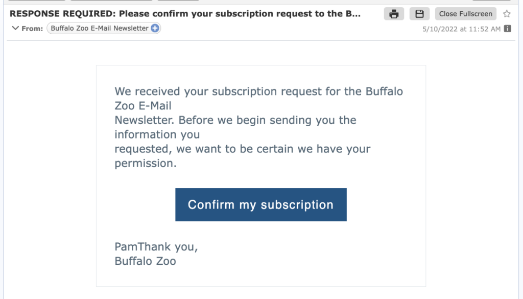
Here’s an example of a sign up form from AWeber customer The Buffalo Zoo.
- Remind the new subscriber to confirm their email address
There are two ways to do this:
- Send the customer to a thank you page that says something like “Thank you for registering, an email with instructions was sent to your email address”
- Set the form to show a message to confirm their address
This is the message someone sees after they’ve submitted their email address to the Buffalo Zoo’s sign up form:
The email should contain a button or link for subscribers to confirm their email address. Keep your confirmation email simple. Remember the goal is to get your new subscriber to confirm their email address.
The Buffalo Zoo uses AWeber’s default confirmation email.
- Create a thank you page
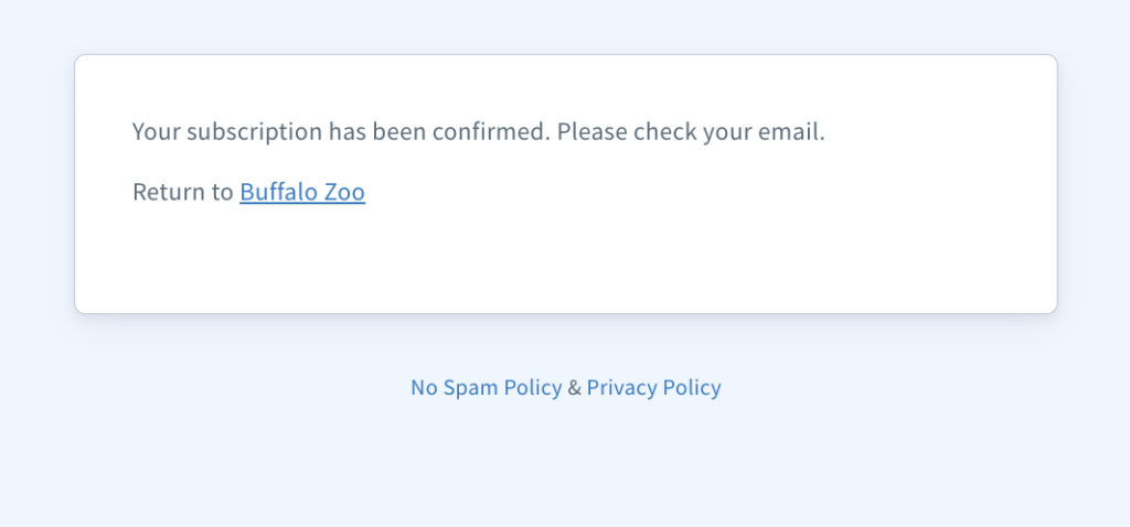
A thank you page is where your subscribers will go after completing the sign up form. Your thank you page can be used to set the subscriber expectation for how often and what you’ll be sending in your emails. It should also be used to encourage them to confirm their email address.
Here’s the thank you page from the Buffalo Zoo:
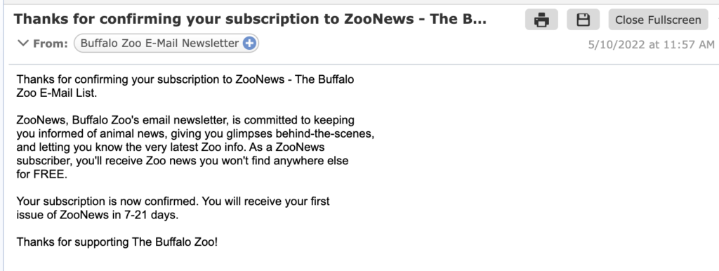
- Send a second confirmation email (optional).
You can also send a final “you are now officially subscribed” email. This is what the zoo does. Here’s what their final confirmation email looks like:
Best practices for double opt-in
There are some mistakes that email marketers often make when setting up double opt-in for the first time.
- Explain to the subscriber why double opt-in is necessary
Give a brief explanation of why double opt-in is necessary. A short sentence such as “We want to protect your data from theft by third parties” is enough.
- Remind them that the confirmation email might go to their spam folder
Even if you follow all the best practices for email marketing, there is still a chance some of your confirmation emails can end up in the spam folder. So remind people to check their spam folders if they don’t see your confirmation email within 5-10 minutes of subscribing.
Your email marketing service will provide you with a default confirmation email. That’s an okay start, but try to do better and customize your confirmation email. You don’t have to redesign the whole email, but at least try to add your company’s logo, change the colors to reflect your brand, and edit the words in the confirmation email so your subscribers feel like you’re welcoming them yourself.
- If you’re collecting first names in your sign up form, use them in your confirmation email.
Start addressing the user by name from the first email you send them. Especially at this crucial first step when they confirm their email address.
Summary and conclusion
Double opt-in is a subscription in two steps: a person leaves their email in the sign up form on the website and then secures consent using a link from the confirmation email. This two-step confirmation process reduces the number of spam complaints and sending errors, as users confirm their interest in the mailing.
Again, to set up confirmed opt-in you need:
- A sign up box
- A prompt to remind the subscriber to check their inbox
- A friendly confirmation email
- A thank you page after they’ve confirmed their email
Double opt-in also helps avoid penalties for processing personal data without a person’s consent. If you follow the best practices we’ve outlined here, you can have all the benefits of a high-quality list and not slow your list growth down. Some email senders get 96% of their new subscribers to confirm – even with confirmed opt-in!
What are you using for your email lists – double opt-in or single opt-in? Have you ever considered switching from one to another? Leave a comment below and tell us what you think.