How to create landing pages that convert (plus top examples & templates)
By Chandal Nolasco da Silva August 4, 2023
Whether you’re looking to drive sales, sign ups, or downloads, a highly optimized landing page can provide real value by bringing your visitors to a page targeted directly to their needs.
This is important because a landing page tailored to the needs of your customer can increase conversion by 300%.
Now we all want to increase conversion by a couple hundred percent but you can’t just throw up a landing page and like magic, you immediately get conversions. It actually takes a few essential tips. Follow these tips to give yourself the best chance for success. In this blog we’ll go over what it takes to create a landing page that converts.
Establish your USP
Define a strong, value-driven USP (Unique Selling Point) and build your landing page around it.
Your USP is the thing that sets you apart from the competition and the reason why people will choose you over everyone else.
You can use your USP to create strong headlines, images, and copy that resonates with your target audience.
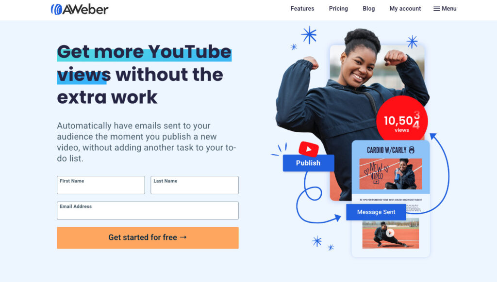
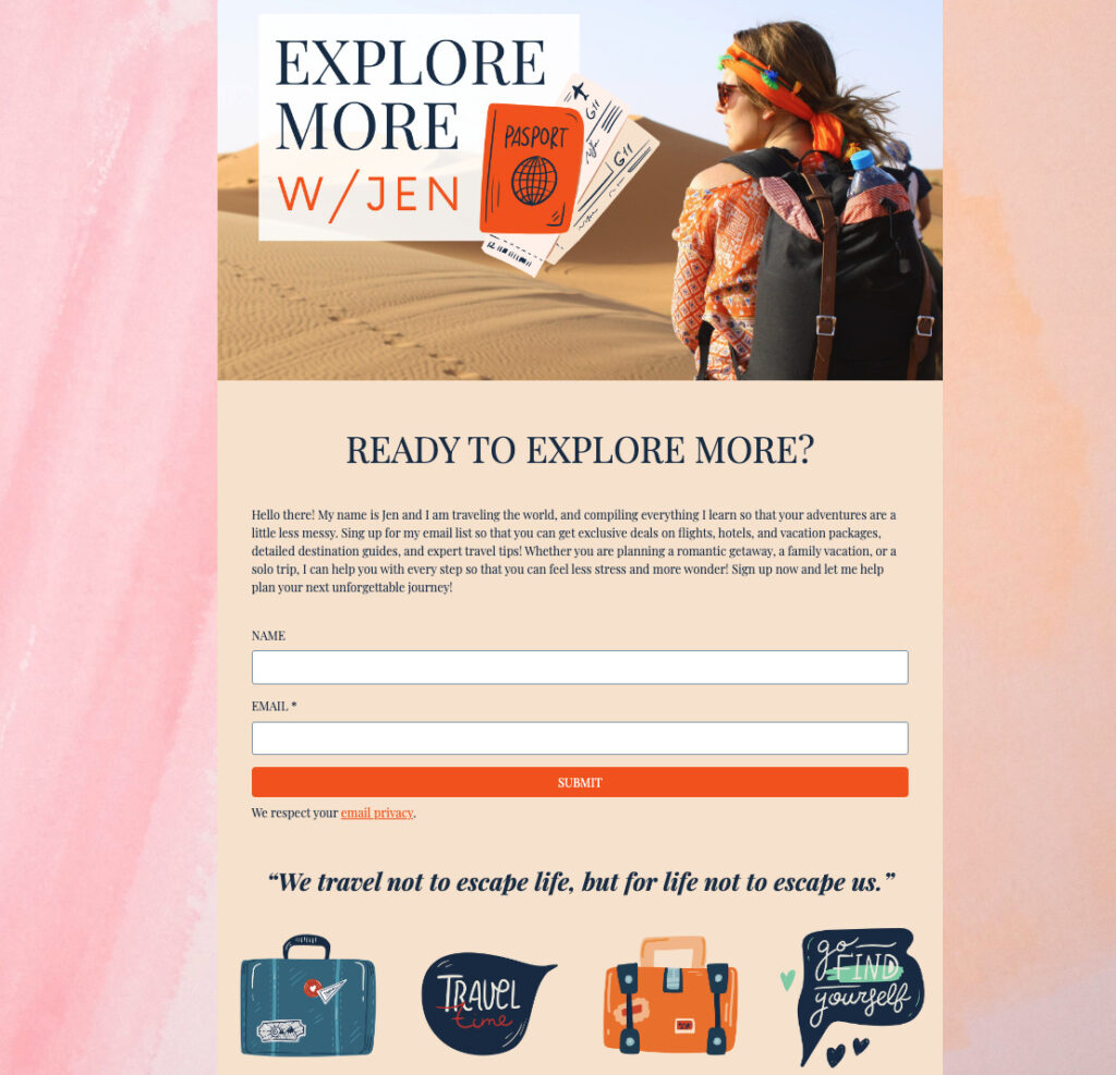
Example of landing page using USP:
In this example, we created a landing page targeted to the unique selling position we provide YouTubers. The headline addresses a key need for this audience, while the image highlights the unique ways we can help automate the increase of video views.
Keep the design clean and simple
Many landing pages suffer because there’s just too much going on. Approach landing page design with a feeling of respect for the time of the visitor.
Keep reader focused
Remember, everything about your landing page should be geared towards getting the user to convert. This means removing anything that might draw their attention away from your offer.
Use of white space
White space is an important part of a landing page design, so make the most of it. Sometimes, what you leave off the page is as powerful as what you include. White space removes congestion and gives the brain space to think. It also forces the eyes to focus on the more important elements of your page.
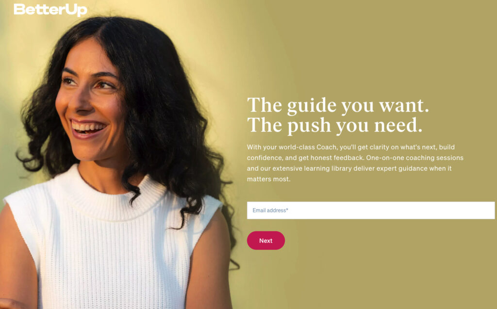
Example of a clean and simple landing page:
BetterUp designed a very simple, yet effective landing page. While not a white background, the design of this landing page give you plenty of “breathing space”, helping your draw the reader in without overwhelming them.
Create headlines that hit home
80% of visitors will read the headlines, that means only 20% will read the rest of the copy, so it’s important that you nail this part of your page.
So needless to say, your headline needs to capture a visitors’ attention immediately and convey your unique value proposition. If it’s vague or doesn’t convey a benefit, users won’t stick around long enough to convert.
Once the headline has the visitor invested, you can reinforce your message with images and copy that persuades them to stay.
Your copy can go into more detail than the main headline, but you should limit it to no more than a few lines of persuasive copy.
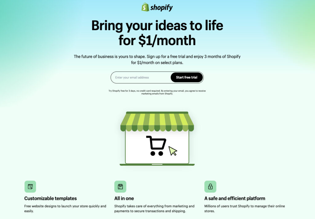
Example of a landing page using a strong headline:
Love this headline from Shopify – “Bring your ideas to life for $1/month”. This powerful headline will definitely resonate with their audience. And including the low pricing point in the header helps eliminate any potential friction a visitor may have to sign up.
Grab their attention with the right images
Humanizing your offer can make it more relatable. One of the easiest ways to do this is using a relevant image. Images play a huge part in converting visitors. They’re the first thing that catches their eye before they read the headline.
Images are processed 60,000 times faster than text by the brain, so what the visitor sees will influence their immediate opinions about your brand and offer.
Like headlines, use imagery to grab attention. Make them relevant to your product or service.
- If you’re offering a product, your imagery should be of the product
- If you’re offering a service, your imagery should relate to what the service is in a way that paints a positive picture in the mind of the user
Remember that you don’t have long to make a good first impression. Make sure images are large and high-quality. Try to stay clear of stock imagery — you don’t want to show visitors something they may have already seen.
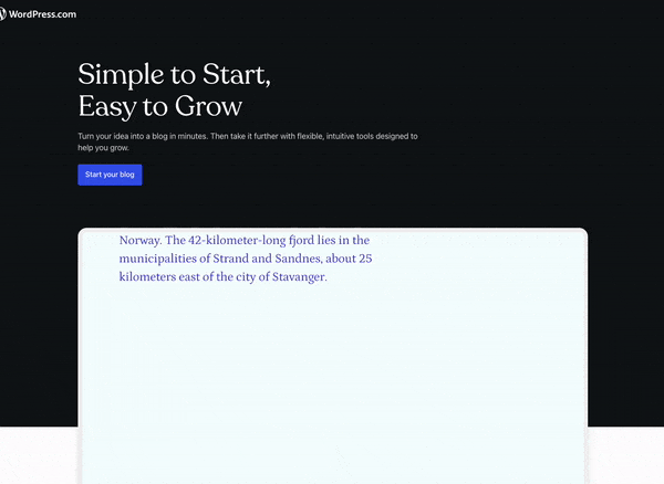
Example of a landing page using imagery to grab attention:
WordPress.com goes a step further by showing a GIF of their platform in action.
Less is more
Let’s face it: the average attention span is shorter than ever – eight seconds, to be exact. So when you craft large blocks of text, you risk lower engagement and fewer conversions.
So your content needs to be easily scannable and highlights the most important elements. This way, visitors can quickly determine whether your solution is right for their needs.
When it comes to writing out the benefits of your offer, focus on clarity. Clearly explain how what you’re offering can solve the user’s problem. But do it in as few words as possible.
Why? Because landing pages with more than 800 words have a 33% lower conversion rate than pages with less than 200 words. Bullet points are a great way to keep things concise and make benefits easily digestible for the user.
Bullet points also allow you to use minimal text and draw attention because of the way they’re styled. And when you combine bullet points with white space you increase their effectiveness even more.
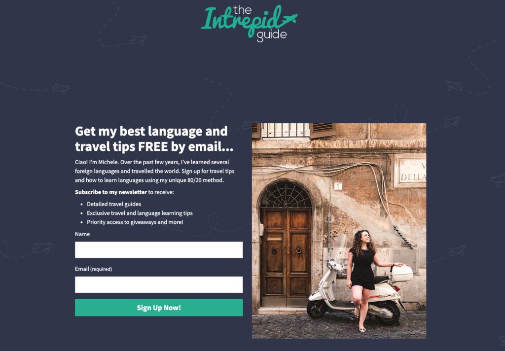
Example of a less is more landing page:
Here’s a simple, clean, to the point landing page example from The Intrepid Guide.
Make calls-to-action strong and clear
Every element of your landing page is designed to get visitors to notice and click on the call-to-action.
The golden rules of form optimization are to keep it concise and feature a compelling, unique call-to-action.
If your form is too long, you may scare visitors away because you’re requesting too much information. And if your call-to-action (CTA) isn’t personalized or it’s difficult to find, you jeopardize the chances of converting your visitor into a customer.
Here are a few things to keep in mind when creating your CTA:
- Make it big enough not to be missed
- Always use a button. People are conditioned to expect a button, don’t throw a curveball at them
- Use a contrasting color that attracts the eye
- Use actionable words (e.g. “Get your Free Trial,” “Buy Now,” “Download Now,” etc.)
Powerful CTAs are an important part of landing pages that convert at a high rate. You don’t want to make visitors guess or even have to think deeply about an action.
What is your goal? Are you creating an email capture landing page? Whatever your desired action, the CTA should be obvious and ready to capitalize on this goal.
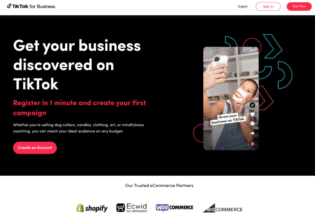
Example of a strong CTA on a landing page:
This CTA from TikTok checks all the boxes. It’s clear with the action they want the visitor to take, the red against a black background really makes it pop, and it uses an action word.
Include contact information
Contact information tells the visitor that you’re a real company. It lets them know that there’s someone behind the landing page, which increases trust.
Including a physical address and contact phone number is the most basic way of adding legitimacy. What those things don’t do, though, is encourage contact. If you want to be helpful to visitors, give them a way to get in touch online. There are three ways you can do this.
- Include a chat pop-up that follows the visitor down the page, making you available to answer any questions
- Include a contact form on the page
- Include a contact call-to-action that clicks through to a dedicated contact page
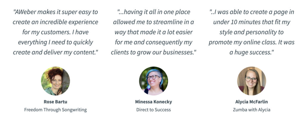
Add social proof
Adding social proof is a great way to build trust and credibility, and it gives consumers more confidence when making a purchase.
Did you know that 91% of shoppers read online reviews before making a purchase.
If you don’t have testimonials yet, don’t worry it’s easier than you think to start building a database with all the great things your customers or subscribers are saying about you. A simply way to start is by asking for feedback in an email or social media channels.
High converting landing page templates
You don’t need to start from scratch to create landing pages that convert. You can use a landing page builder that already has a collection of beautifully designed templates.
Start with a template that closely aligns with your goals, then customize it to reflect your branding and messaging.
Here are a few high converting landing page templates that you can use in an AWeber account.
These templates are meticulously crafted to skyrocket your conversion rates and leave a lasting impression on your audience. You can also check out over 100 other landing page templates.
Click here to use the above landing page.
Click here to use the above landing page.
Click here to use the above landing page.
Click here to use the above landing page.
Click here to use the above landing page.
Now it’s your turn…
As you optimize your landing page, be sure to reflect on what’s working and what isn’t. Then test new ideas and tactics to continue improving your conversion rates.
Once your landing page starts converting, it’s a sign that it’s working, and people are putting their trust in you to deliver on what you say. Repay trust and reward loyalty by emailing customers with content that adds value and personalized offers. Once a person has opted-in to your email list, use it to your advantage.
Not sure what to include in your emails? Download 45+ free writing templates to learn how to craft emails like a pro.